Nigerian Railway Corporation (NRC): Complete Digital Ecosystem Redesign
Redesigning the NRC booking platform to eliminate critical UI issues, improve task completion, & restore passenger ticket revenue.


Redesigning the NRC booking platform to eliminate critical UI issues, improve task completion, & restore passenger ticket revenue.
The existing NRC digital platform suffered from critical UI design errors (poor spacing, hierarchy, color use) that made navigation difficult, causing the majority of users to abandon online booking in favor of less efficient station visits. The core problem was converting manual station users to reliable digital users.
How might we redesign the three primary digital interfaces (Web, Mobile, Landing Page) to boost navigability, drive successful transactions, and shift user behavior from manual to digital booking?
I created a unified, clear, and feature-rich digital experience that made navigation simple, directly targeting an increase in online task completion and successful revenue generation.
2025
3 months
Product Designer
Figma
This was a comprehensive redesign of an existing, multi-platform system. The project required deep diagnosis of existing UI/UX issues that were actively costing the business revenue, demanding a solution that addressed systemic inconsistency and usability friction.
My process began with diagnosis to ensure maximum ROI from the redesign efforts. I initiated the process with user research (surveys & interviews), which confirmed that the core problem was poor UI and navigability, not the underlying UX flow. This justified the comprehensive design overhaul.


1. Diagnosis: Conducted a Heuristic Audit to formally document existing UI failures and inform the redesign.
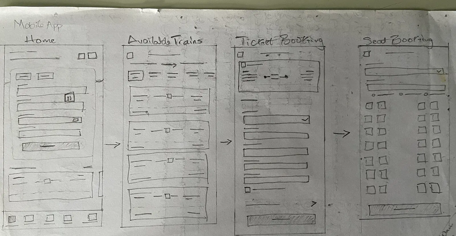
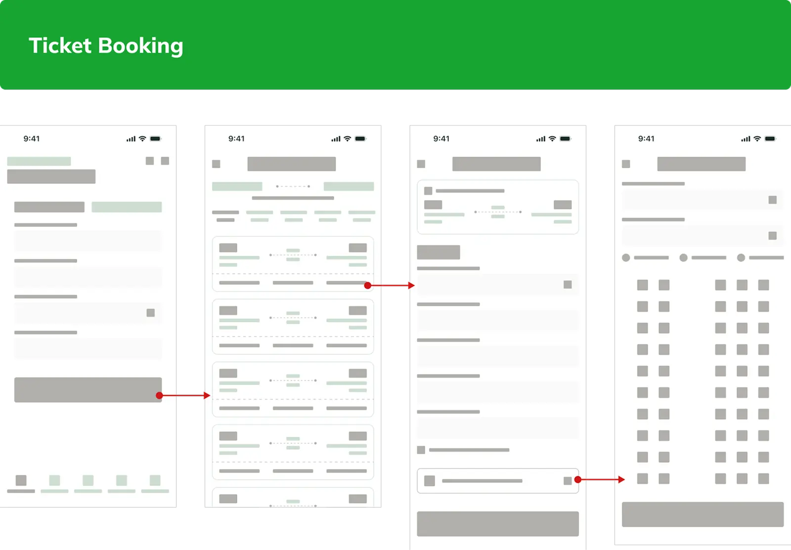
2. Foundational UX: Based on research findings, I created Personas and drafted prioritized User Stories. This informed the new User Flows (Web/Mobile) and initial Sketches & Lo-Fi Wireframes.
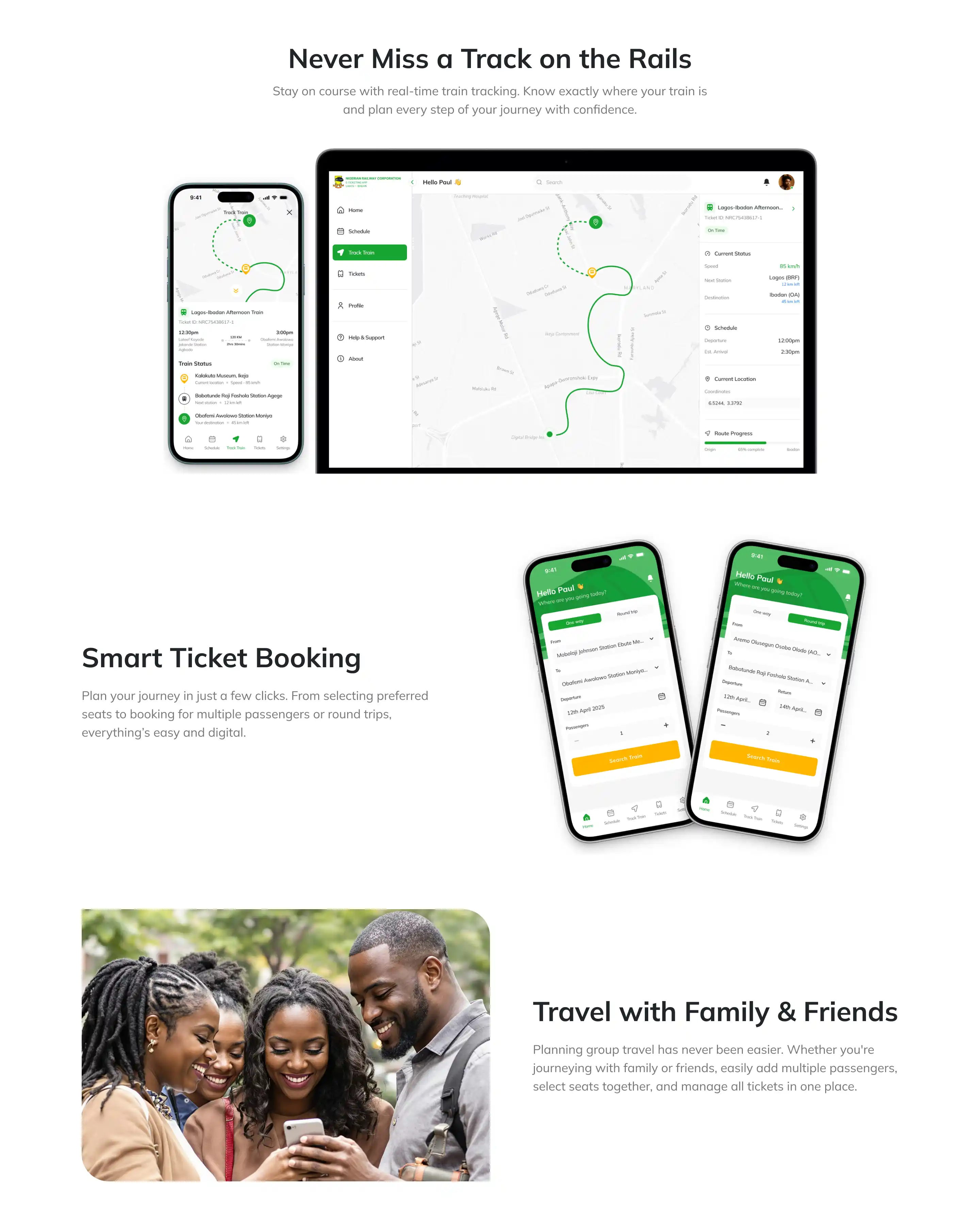
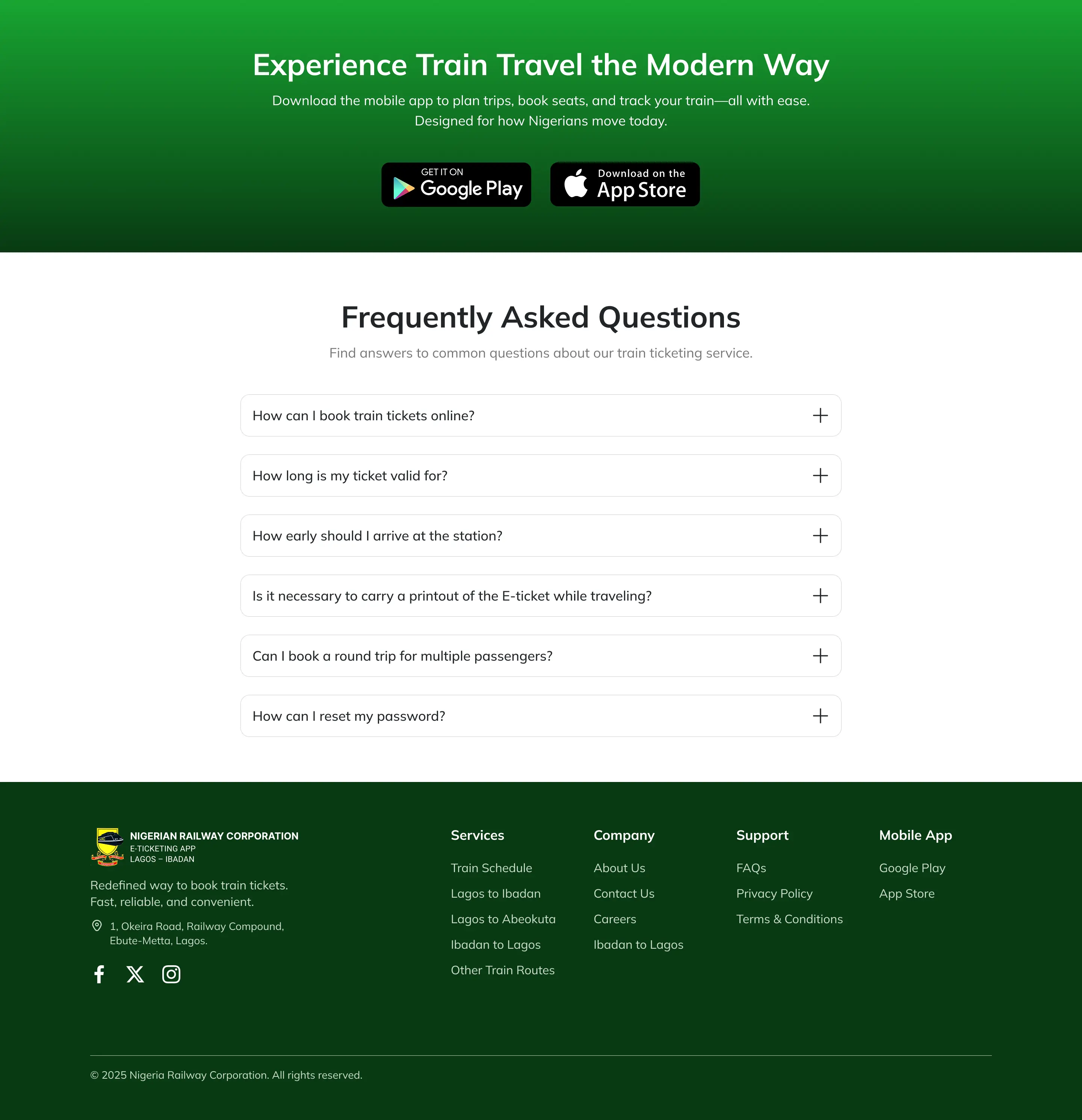
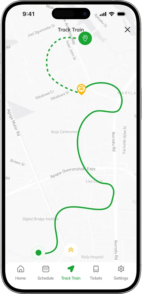
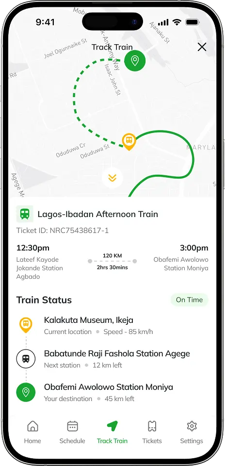
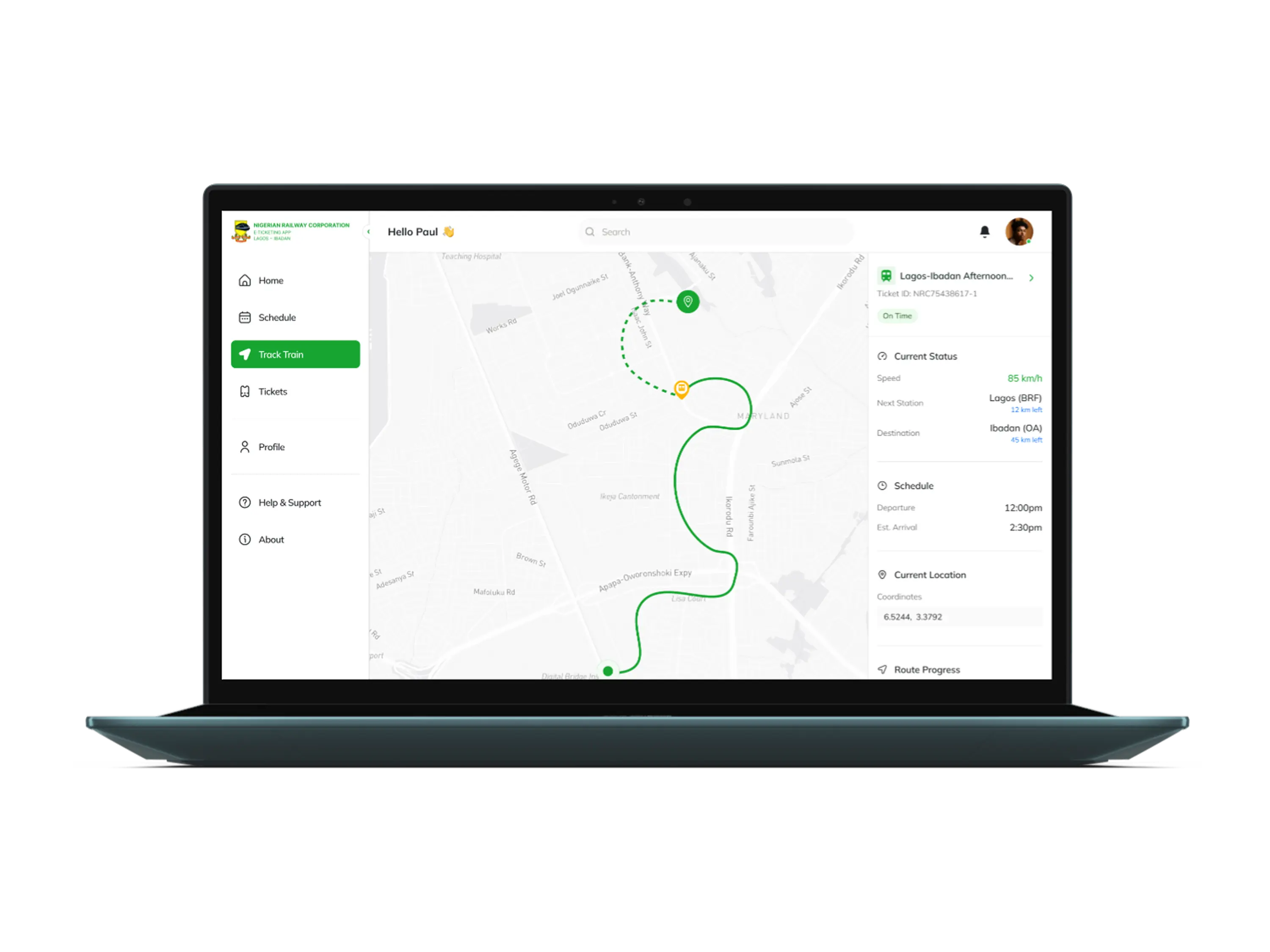
3. Execution: I incorporated high-value features like Round Trip and Real-time train tracking, then applied the new design system uniformly across all interfaces.
The final design delivered a cohesive, professional, and intuitive booking platform that eliminated confusion.
1. Problem to Solution Structure: Clear UI improvements, based on the heuristic audit, made complex navigation easy and intuitive.
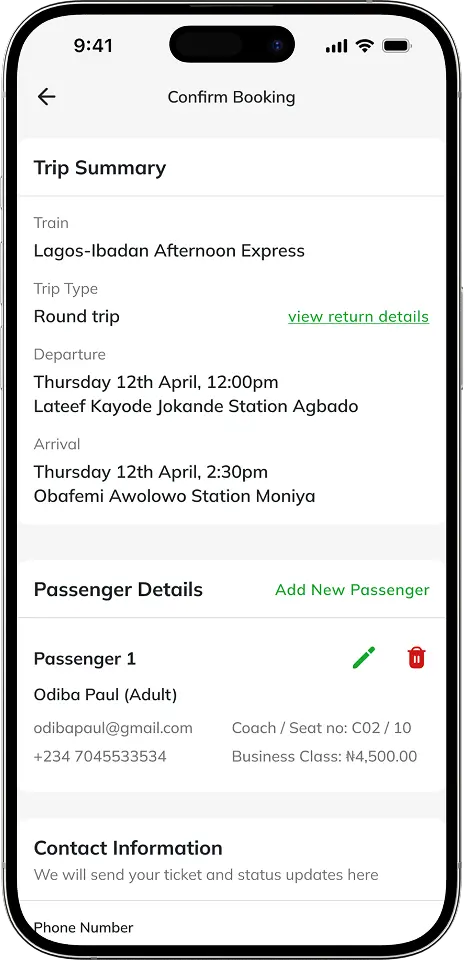
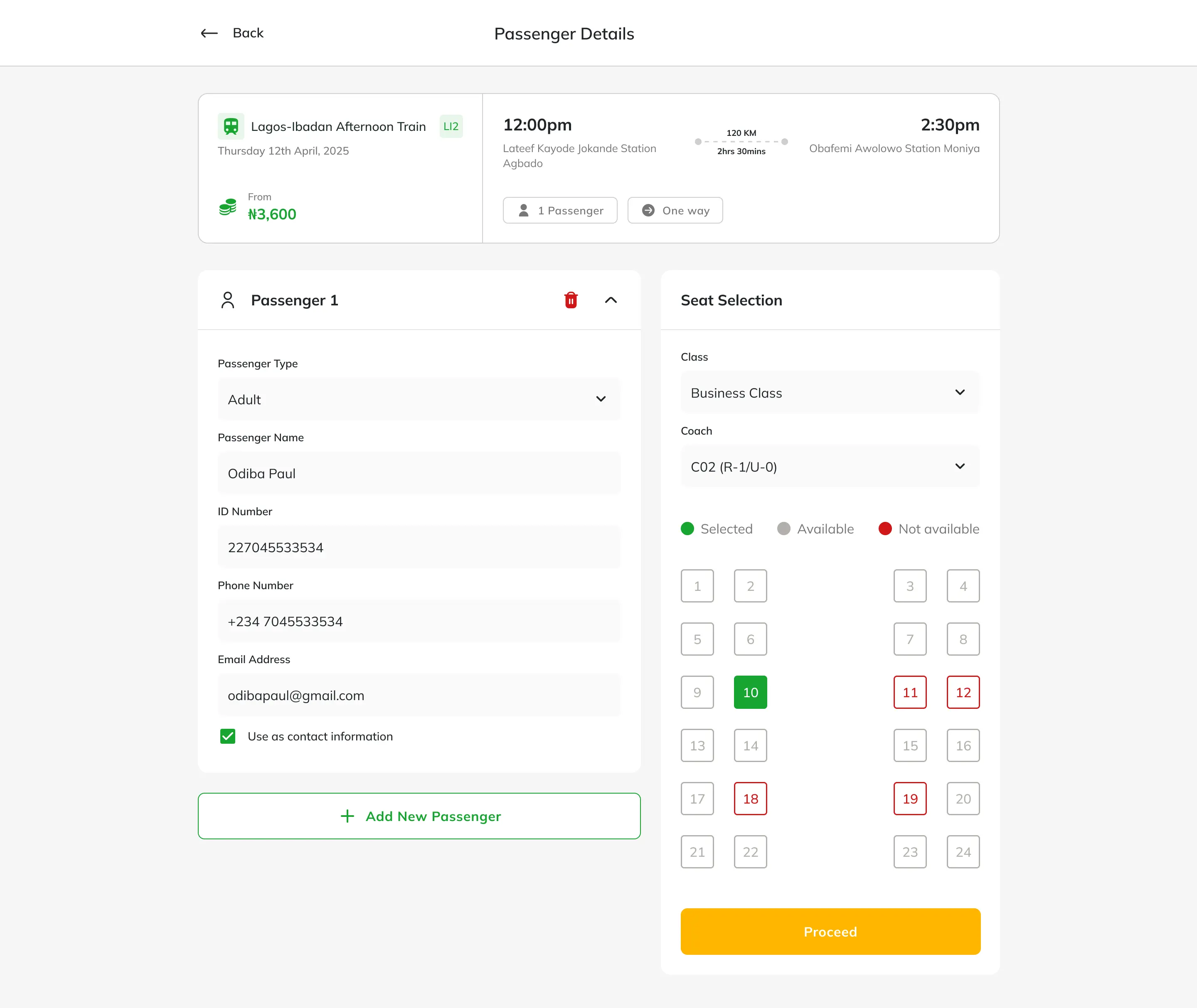
2. Refined Existing Flow: The existing multi-passenger booking flow was analyzed and refined for maximum clarity and efficiency, ensuring seamless group bookings.
3. High-Value Enhancements: Integration of Round Trip booking and Real-Time Train Tracking to enhance core functionality, providing certainty and increasing user value.
4. Unified Design System: A clean, strategic aesthetic applied consistently across all three platforms, building immediate trust and authority
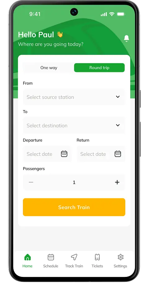
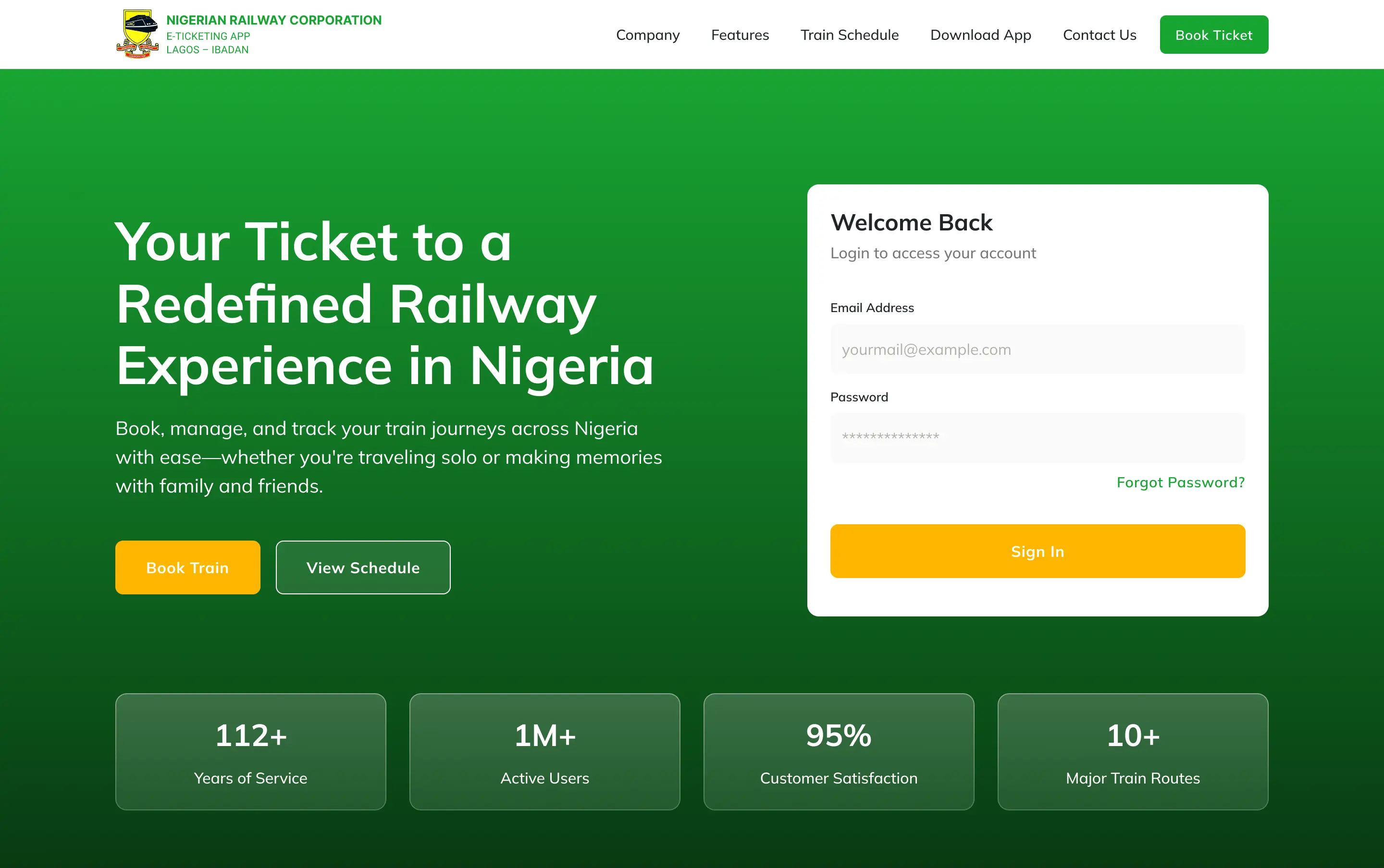
After a mini usability test, I found out that my initial design of the hero section caused a brief hesitation on what to do first. There were too many CTAs on that section and users needed a clear path to complete their task. So I made iterations with a clear and primary CTA.
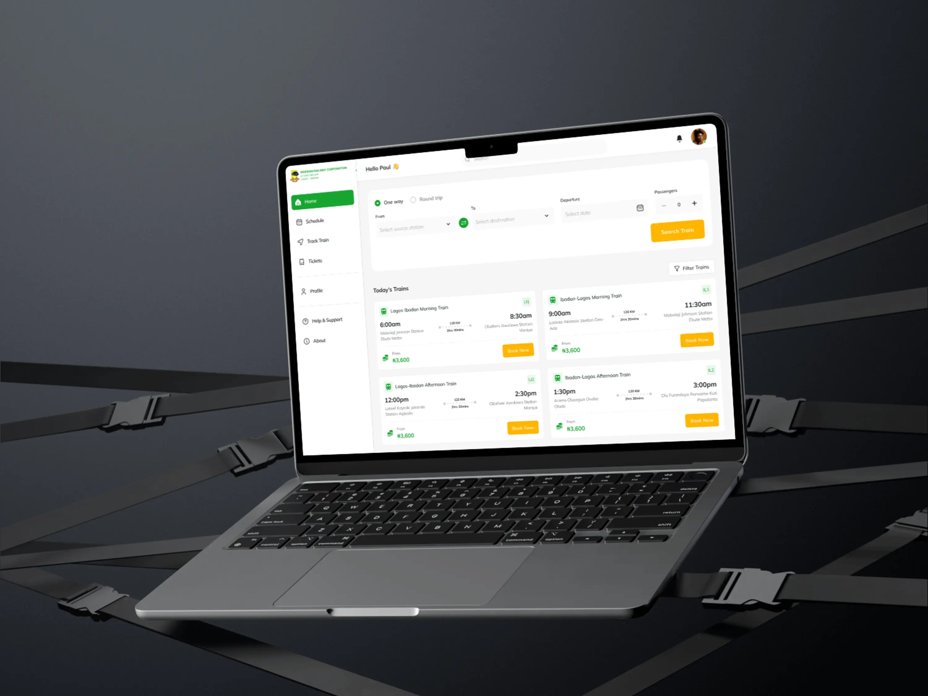
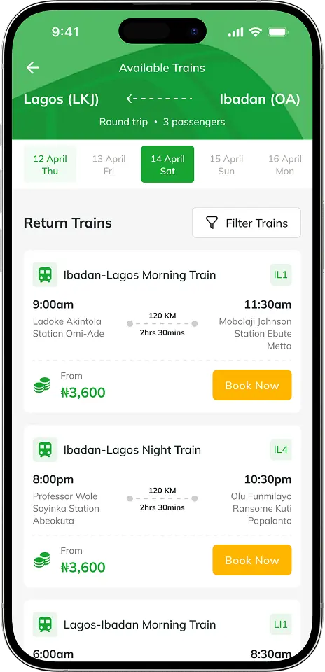
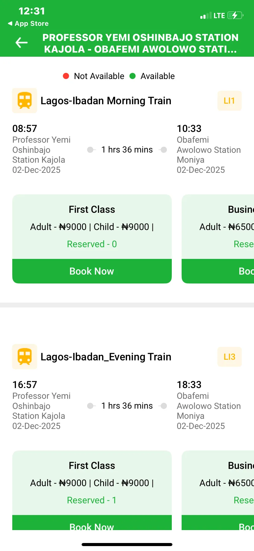
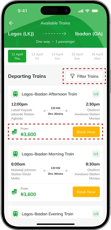
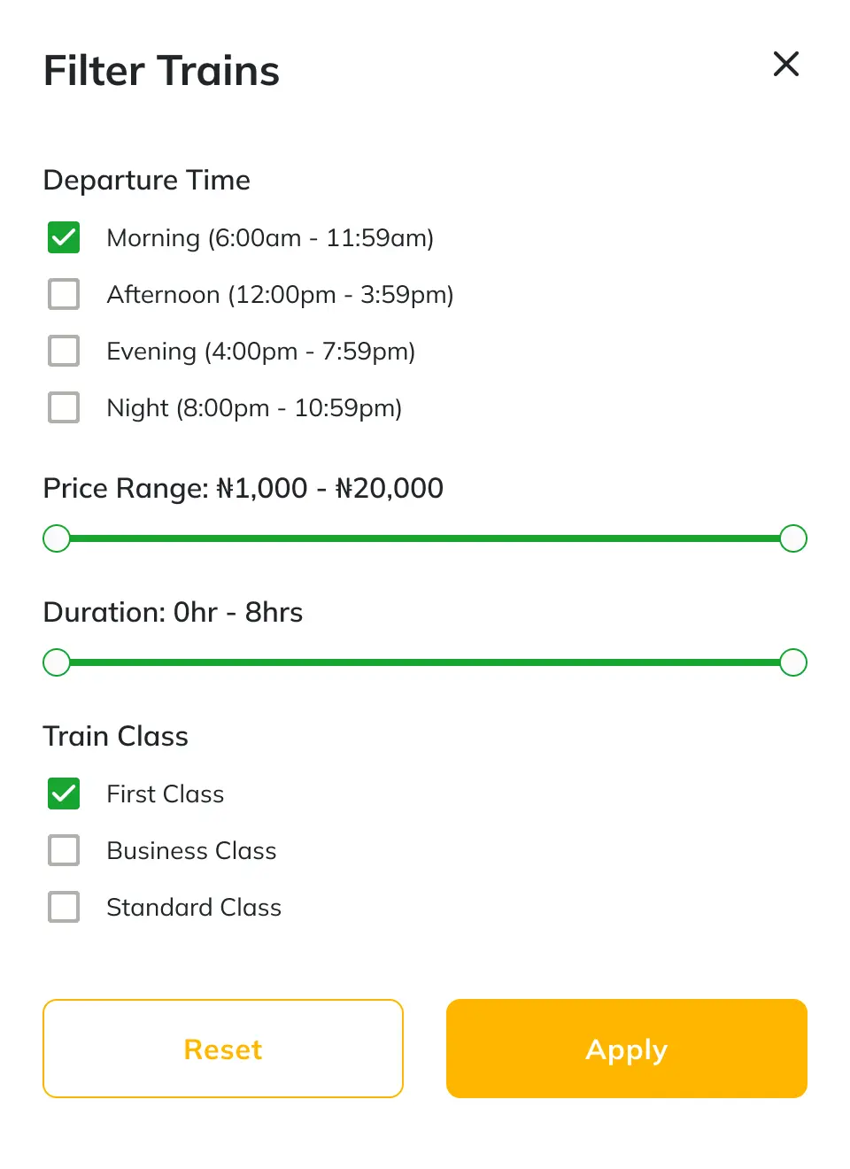
An example of how strategic UI/UX changes optimized the core booking screen. While the previous interface clearly showcased all class options (a good idea for transparency), it created a redundant step: users still had to re-select the class when choosing a seat. The redesign consolidated this by showing only the starting price and a single "Book Now" action. This, combined with the new Train Filter, eliminates unnecessary clicks and significantly improves the Task Completion Rate.
This project is highly relevant to service businesses as it shows the ability to translate user feedback into a substantial increase in successful transactions.
1. Projected Outcome: The clear UI improvements made navigation easy, which aims to reduce booking drop-off rates by at least 62%, directly increasing successful ticket sales.
2. Relevance: This work proves my ability to modernize high-stakes platforms, bringing the experience in line with modern booking platform standards.
3. What I Learned: I confirmed that on high-stakes transaction platforms, poor UI is a direct, quantifiable cost to the business, demanding strategic attention to drive successful task completion.
CRMHUB needed a landing page for a new mobile platform with zero online presence. I shaped the first impression so users understood the product fast and trusted it enough to sign up or download the mobile app.
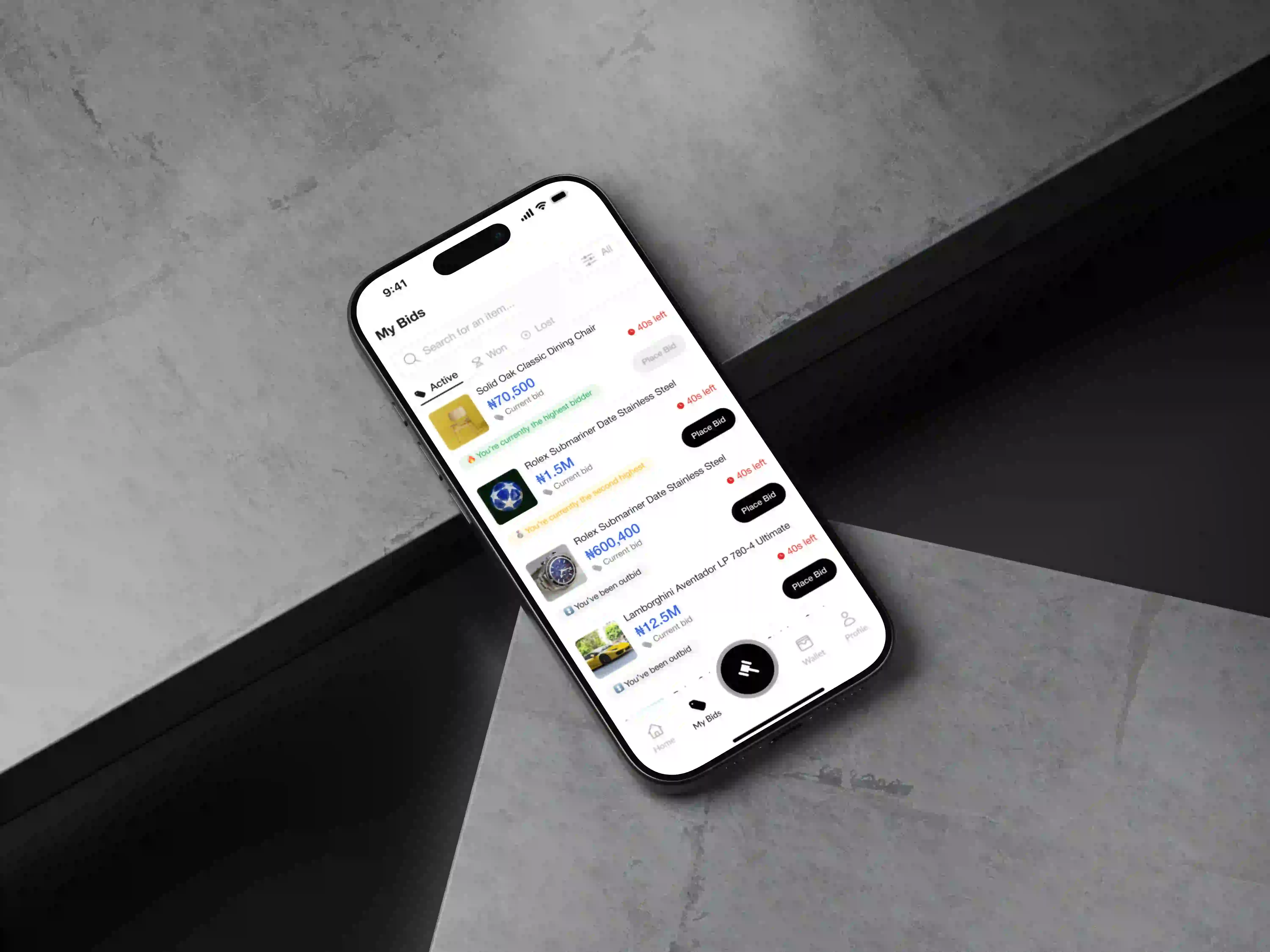
A bidding app only works if users trust it and return daily. I designed a clear, engaging experience that encouraged repeat bidding and gives buyers and sellers reliable protection during every auction and transaction.

Use the form to share an overview of your project. I will reach out to you within 24 hours to discuss a strategy tailored to your goals.