CRMHUB: Digital Front Door Design
Developing a high-conversion landing page to drive initial user acquisition and establish product authority.


Developing a high-conversion landing page to drive initial user acquisition and establish product authority.
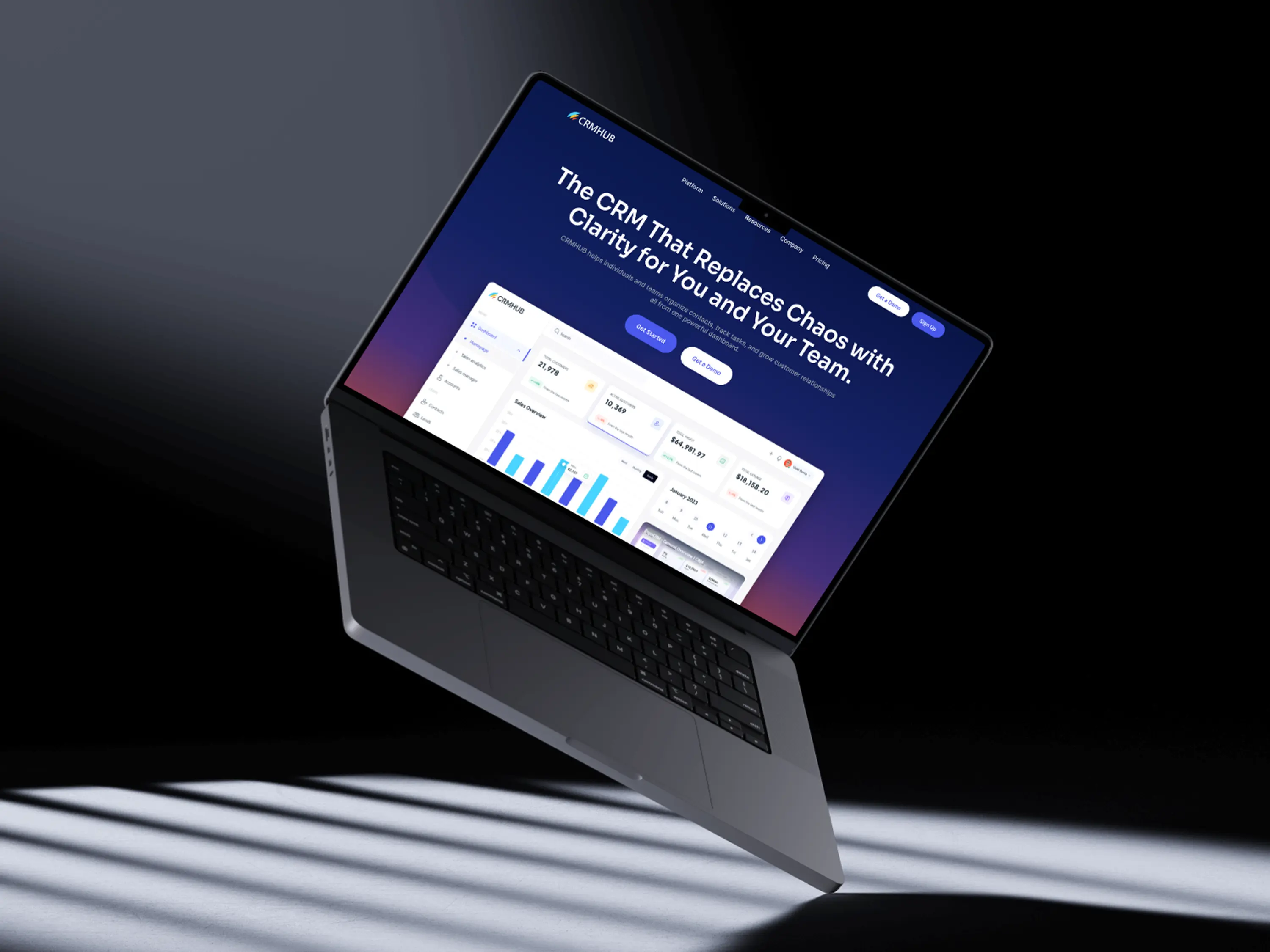
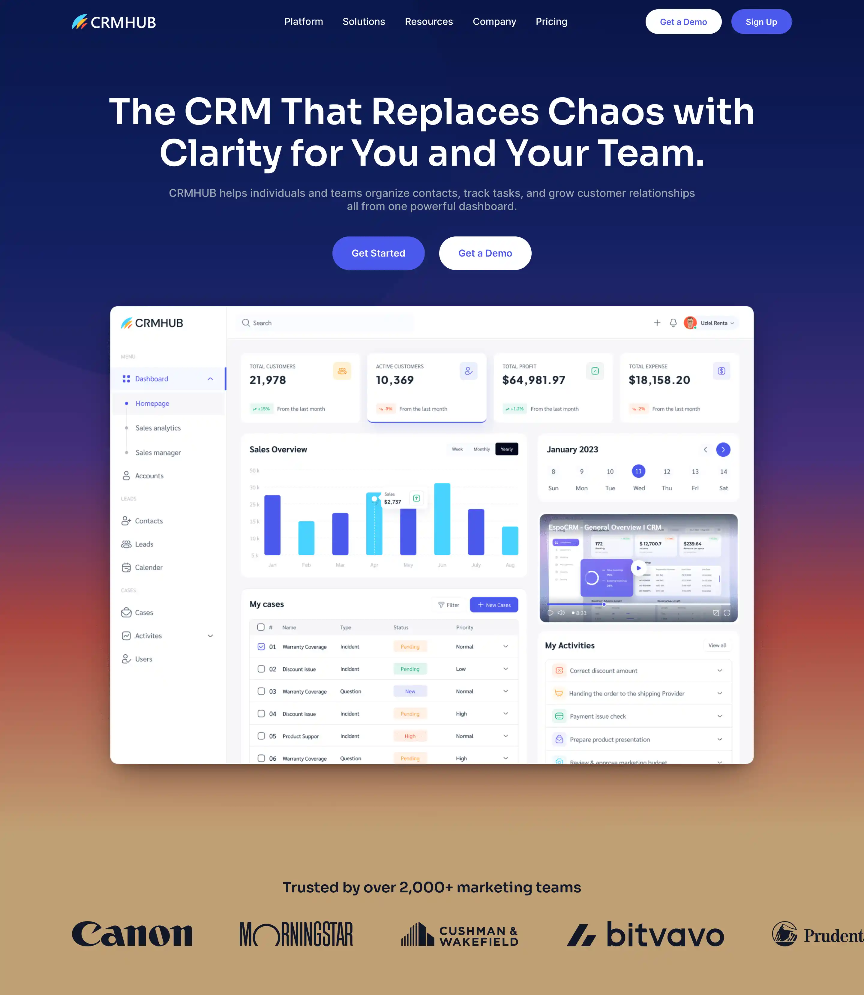
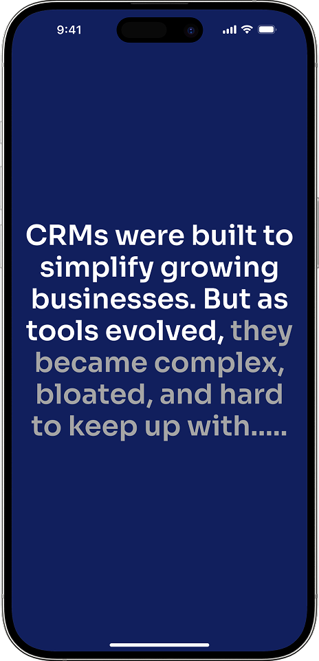
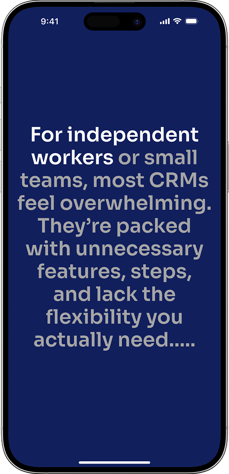
With the launch of the new CRMHUB mobile and web app, it required designing its entire digital presence from scratch to establish immediate credibility and convert skeptical visitors into first-time sign-ups. The high-stakes challenge was solving the zero-to-one user acquisition problem in a competitive market where lack of brand trust leads to high bounce rates and low conversions.
How might we build a single, authoritative landing page that transforms skeptical, first-time visitors into high-intent sign-ups for a brand-new SaaS product?
I created a clean, strategic landing page experience that establishes immediate authority, clearly communicates the product's value, and guides the user toward predictable conversion and business growth.
2024
2 weeks
Web Designer,
Conversion Strategist
Figma, Webflow
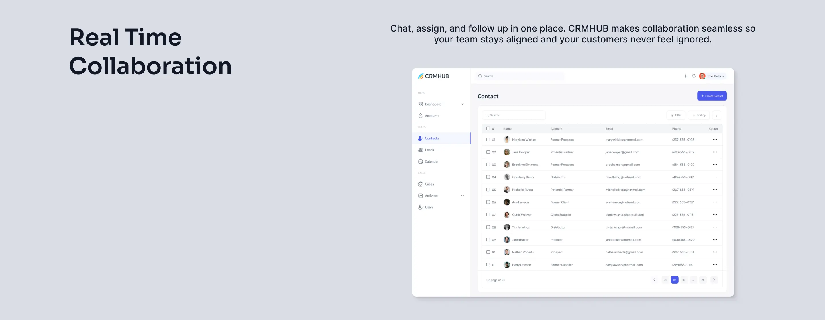
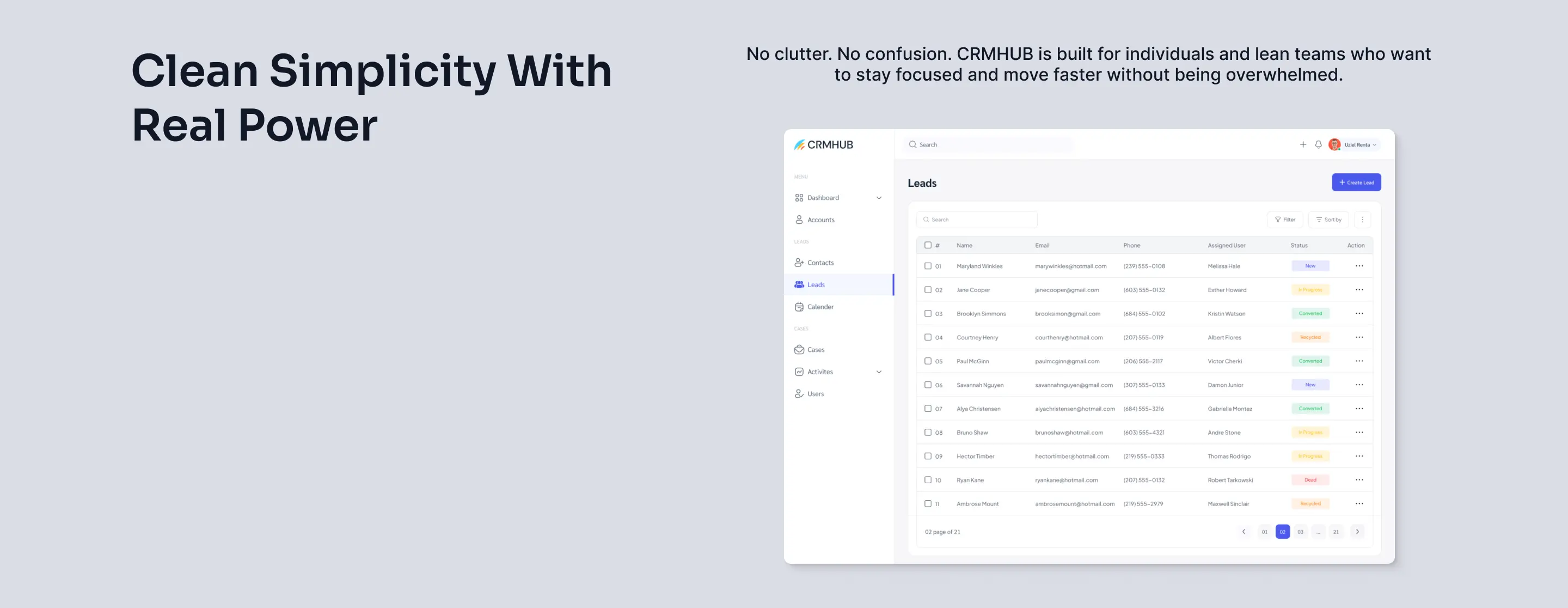
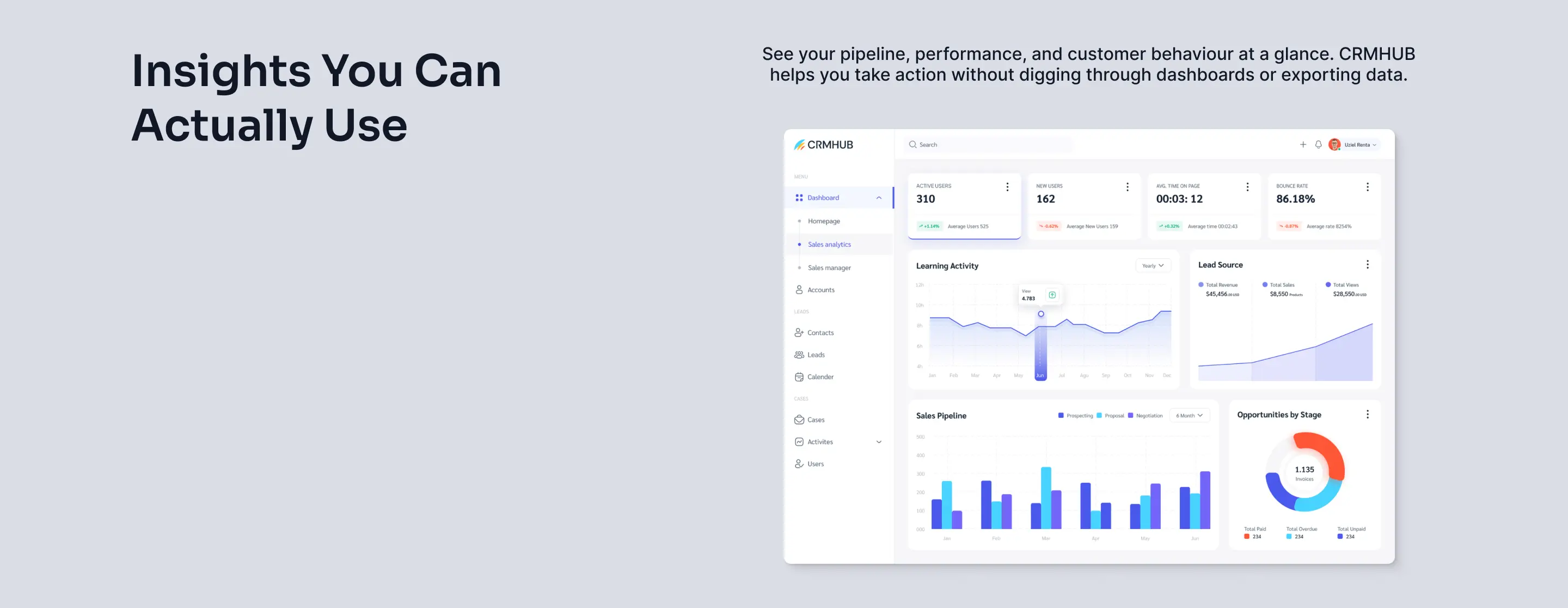
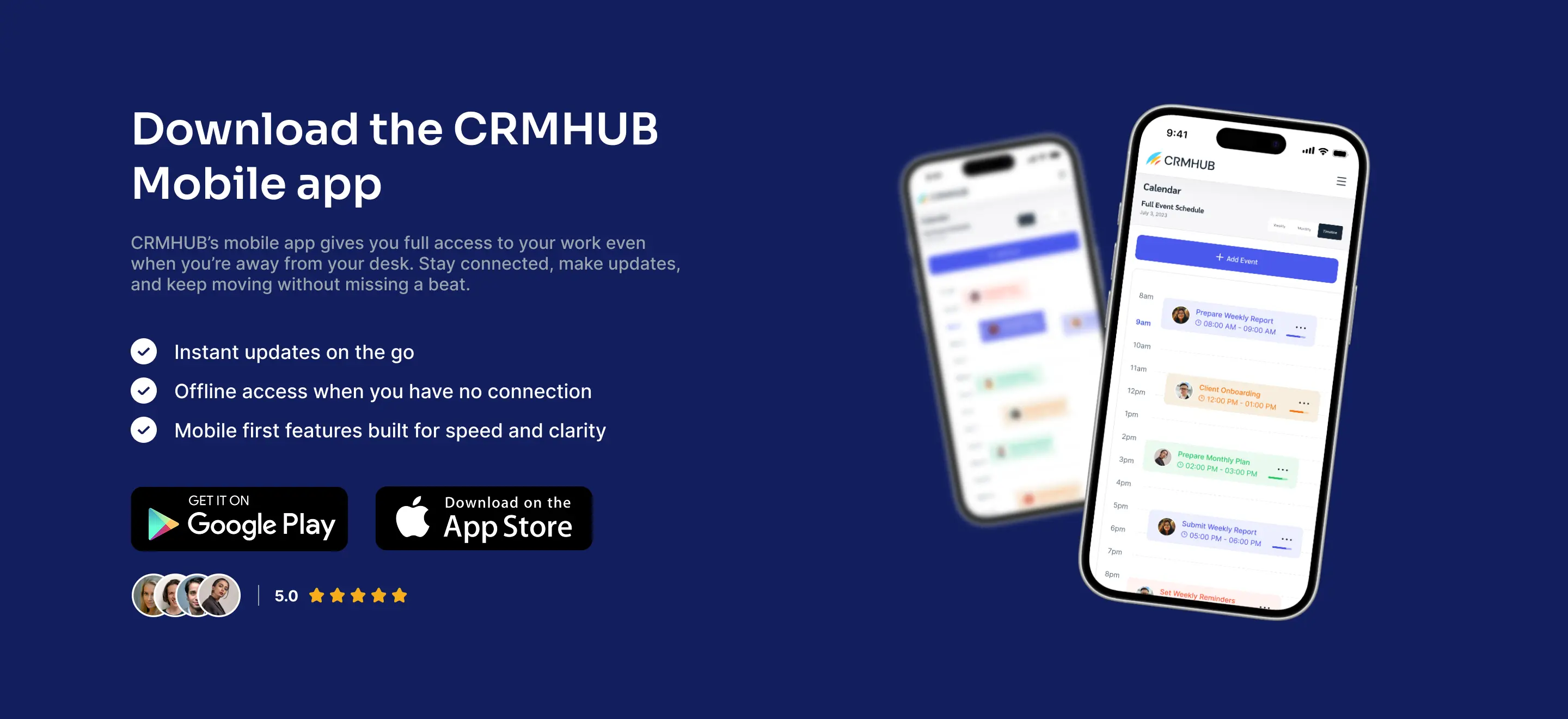
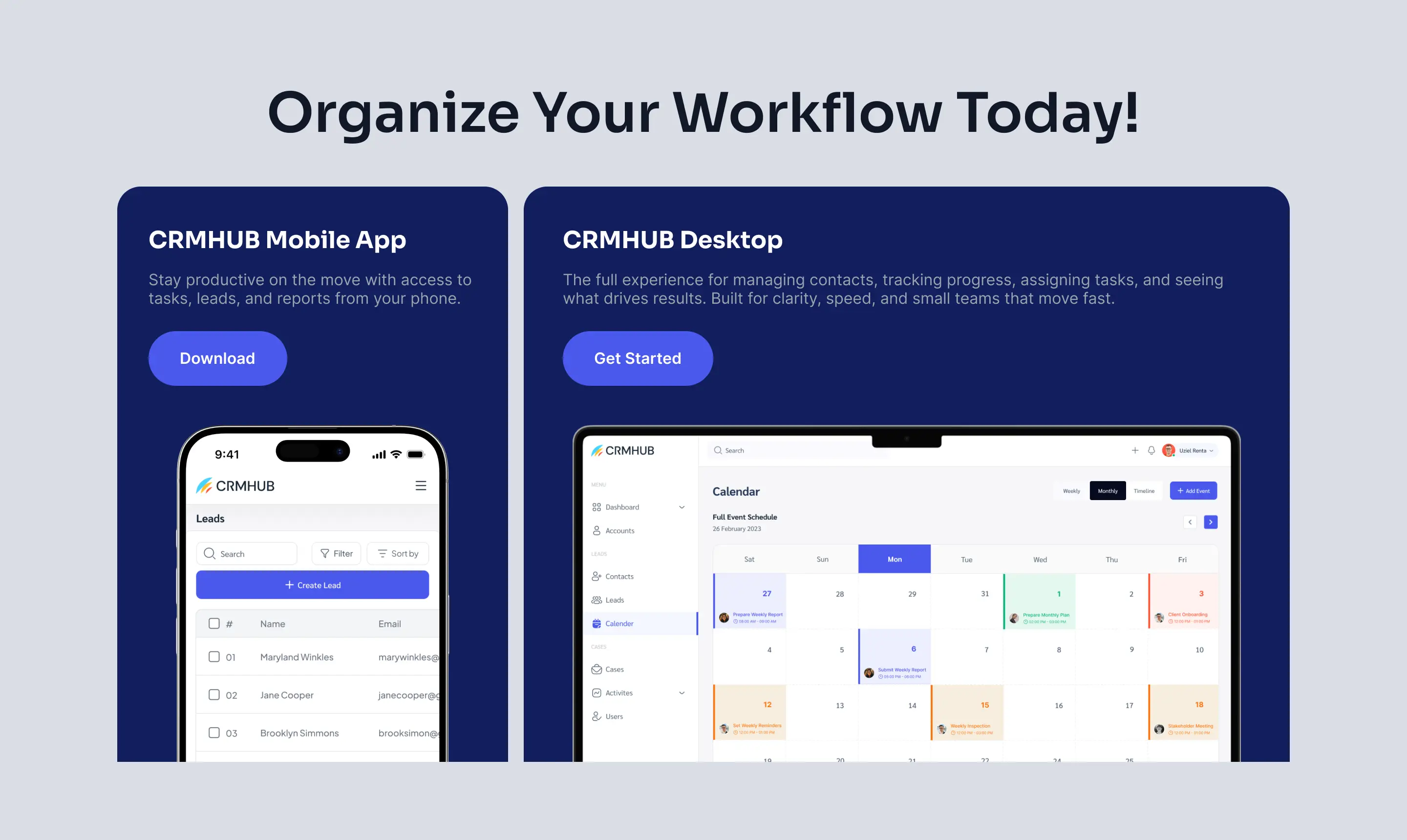
The CRMHUB mobile and web apps were already existing. This project was the greenfield design for the landing page, their digital front door. This allowed me to build the information architecture purely through a conversion-focused lens, starting with some social proof.
My approach employed a mix of empathetic insight and logical structuring to design a robust conversion path. I anchored the design by first identifying the target audience's core pain points, then immediately positioned CRMHUB as the definitive solution.
I mapped the flow using a logical narrative path:
Problem Identification > Solution > Benefits > Trust > Action.
This involved building credibility with use cases and authority signals, and guiding user decisions with highly visible CTAs to ensure the highest potential for Conversion.
A concise, single-page funnel that serves as the entire marketing engine, built upon an empathetic and logical narrative structure.
1. Problem to Solution Structure: Immediately addresses the users’ pain point and positions CRMHUB as the definitive solution.
2. Strategic Trust Signals: Prominent placement of use cases and authority elements (user stats/testimonials) to quickly build credibility.
3. Logical Narrative Flow: Organizes content to guide the user naturally from understanding the benefits to taking action.
4. High-Contrast CTAs: Highly visible calls-to-action placed strategically to ensure the highest potential for Conversion.
This design was engineered to directly address the business goal of rapid market entry and growth.
1. Projected Outcome: The architecture is projected to achieve a 40% higher click-through rate to the sign-up form compared to industry standard brochure pages.
2. Relevance: This project is highly relevant to SaaS companies and professional firms as it demonstrates the ability to execute a full strategic design from a blank slate, proving a core focus on business results.
3. What I Learned: The exercise confirmed that the most efficient design is the one built entirely around mitigating user risk and prioritizing a clear path.
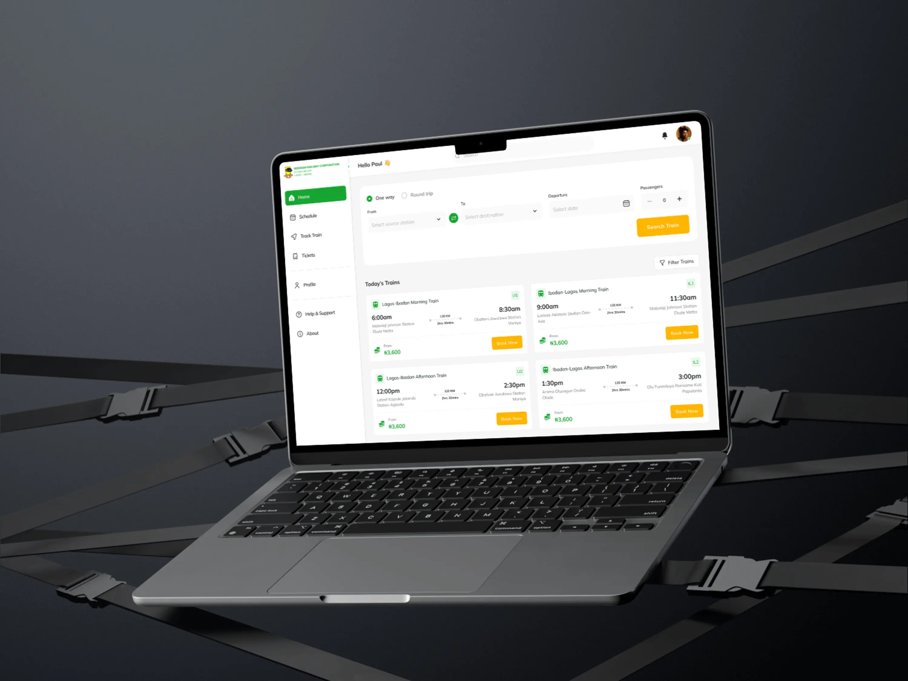
The Nigeria Railway booking system made simple tasks hard. I redesigned the web, mobile, and core app to fix basic UX issues, improve flow, and make the entire experience predictable and usable.
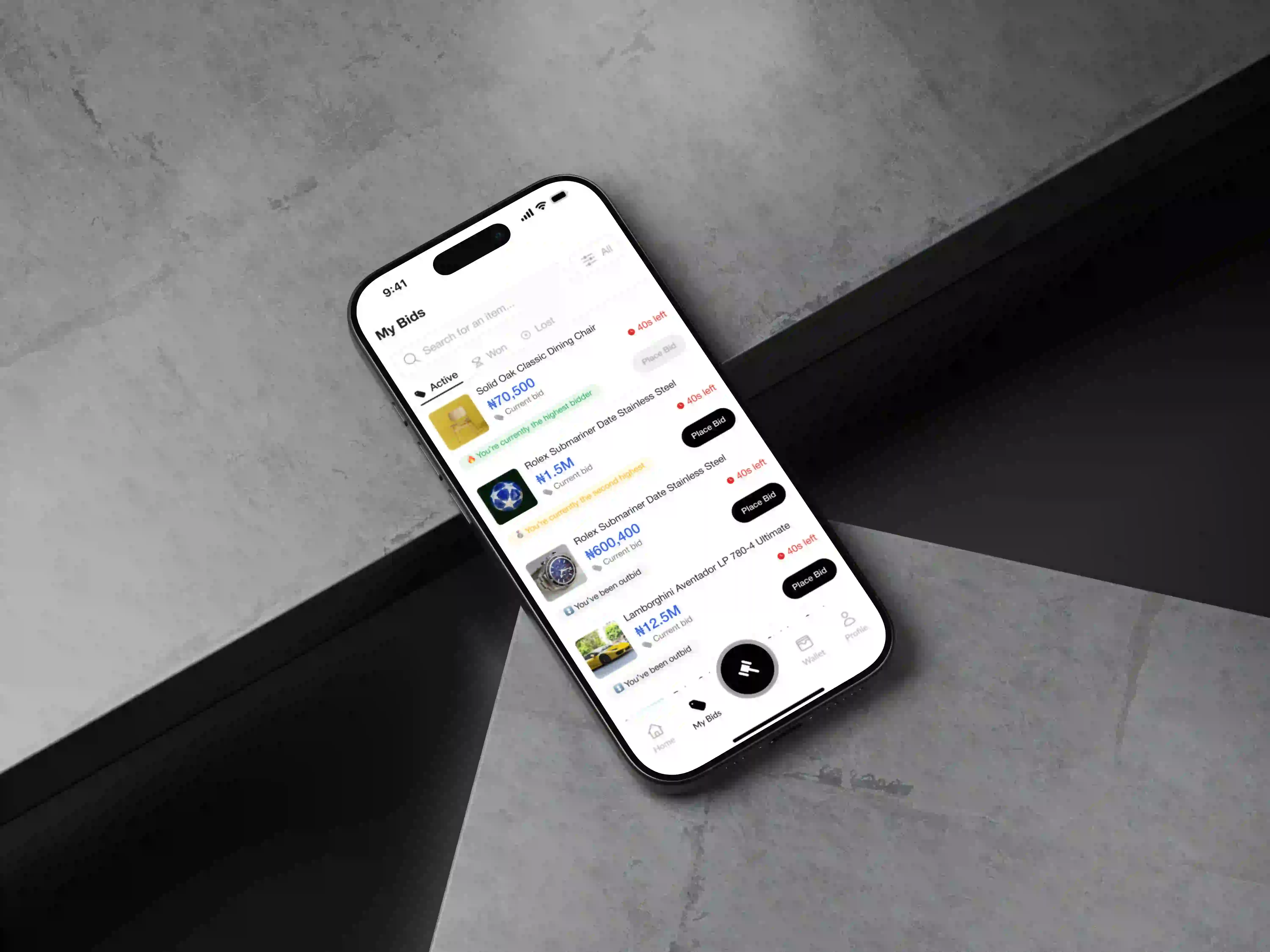
A bidding app only works if users trust it and return daily. I designed a clear, engaging experience that encouraged repeat bidding and gives buyers and sellers reliable protection during every auction and transaction.

Use the form to share an overview of your project. I will reach out to you within 24 hours to discuss a strategy tailored to your goals.